Nike Posters
Nike Posters

Project Description
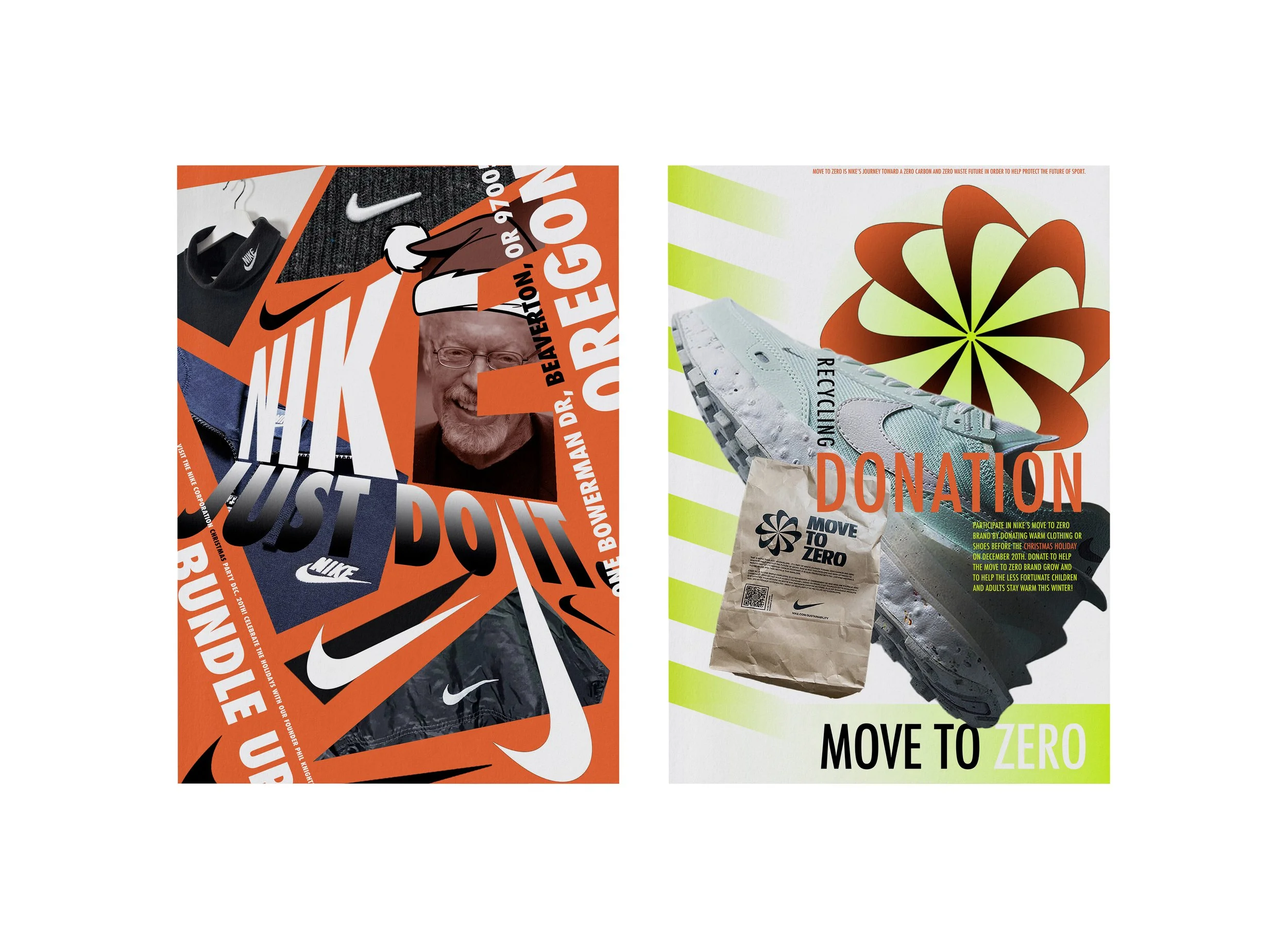
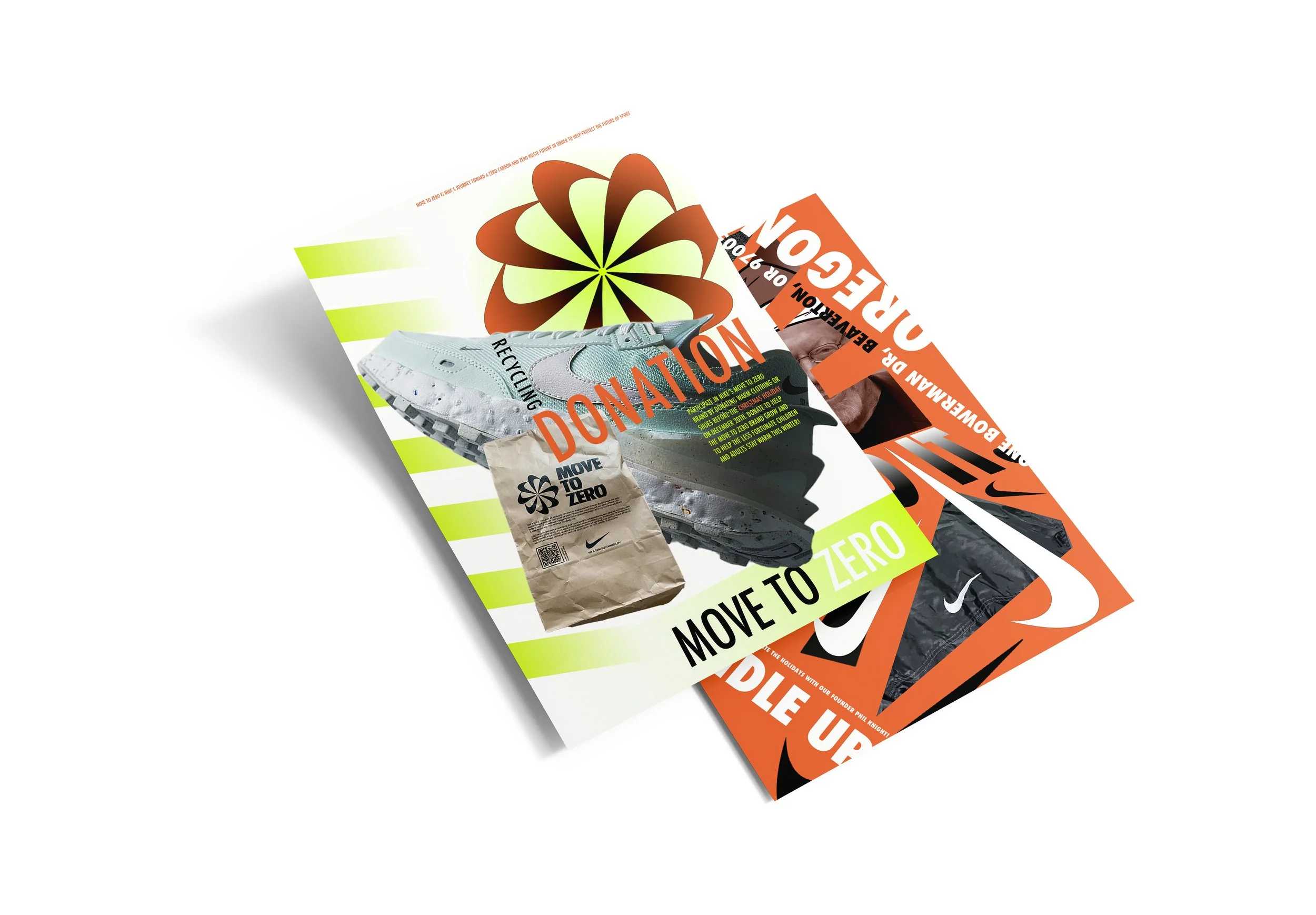
This project explored how typography and imagery work together to create mood and meaning. Inspired by winter pattern studies, I designed two posters using principles from Interaction of Type and Image to experiment with separation, fusion, and disruption. Through texture, hierarchy, and balance, each composition translates seasonal concepts into a clear visual narrative.

Project Overview
Poster 1
A Nike-inspired poster using bold orange, jagged forms, and apparel imagery to express winter’s energy and my connection to sports and fashion. Type and image work together to create a unified, dynamic composition.
Poster 2
A clean, minimal layout inspired by Nike’s sustainability initiative. White space with yellow and orange accents helps type and image merge into a message of renewal and forward movement.


Process & reflection
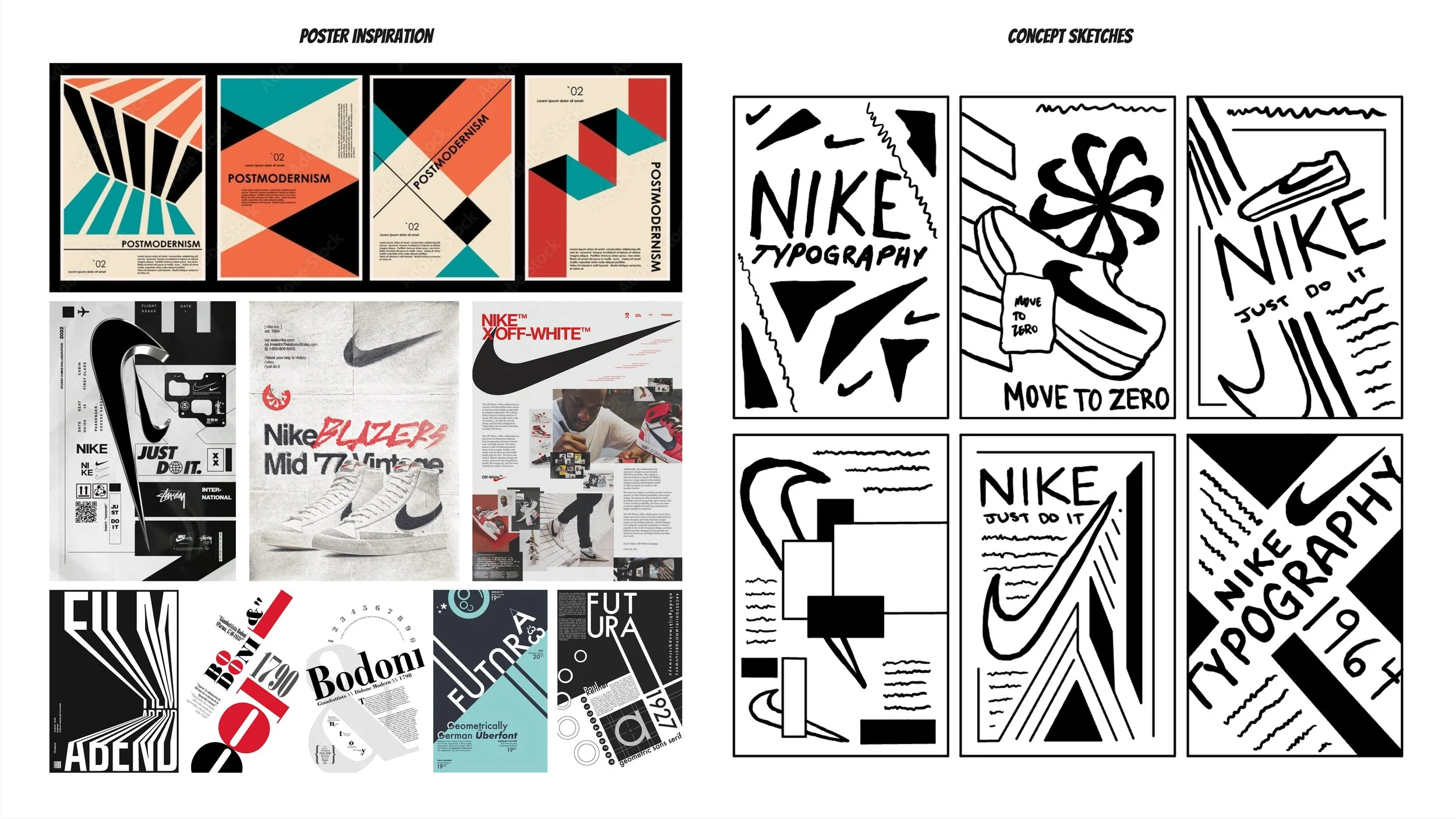
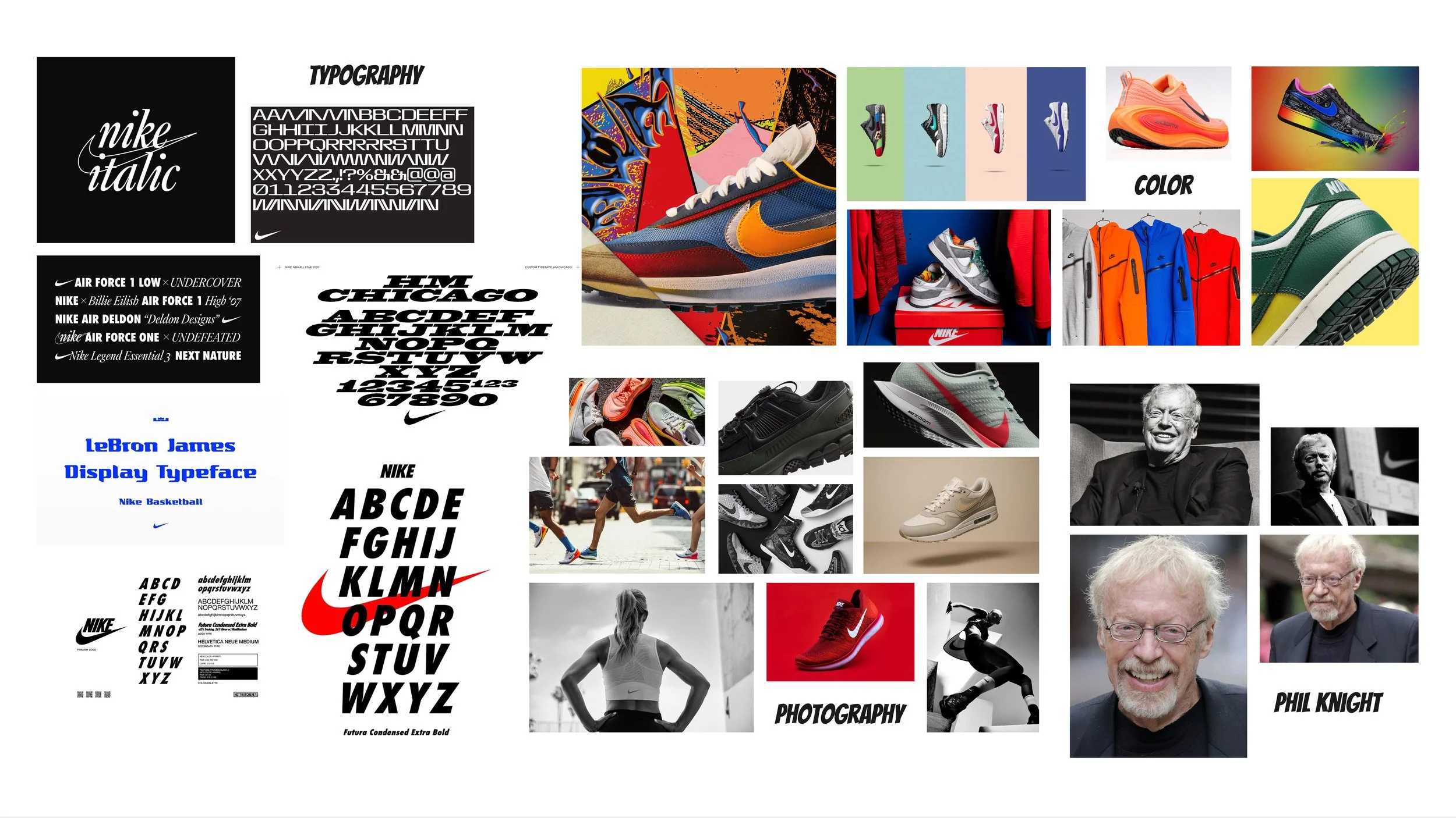
The process for this project involved exploring tools and techniques I was still learning, especially within Adobe Photoshop. I began by collecting inspiration through a mood board and rough sketches that helped establish direction and structure. Experimenting with outlining imagery, layering textures, shaping photos, and distorting type allowed me to build confidence with digital tools while shaping the final compositions. This workflow strengthened my ability to connect design theory to brand storytelling and pushed me to think critically about hierarchy, composition, and tone. Even as a short assignment, it helped refine my visual decision-making and deepen my understanding of how type and image work together to create cohesive, meaningful design.