
Active Minds Rebrand
Active Minds Rebrand

Active Minds is a non-profit organization focused on supporting mental health among young adults through peer interaction and communication. Founded in 2003 by Alison Malmon after the loss of her brother to suicide, the organization empowers students to prioritize mental wellness.

Logo & identity
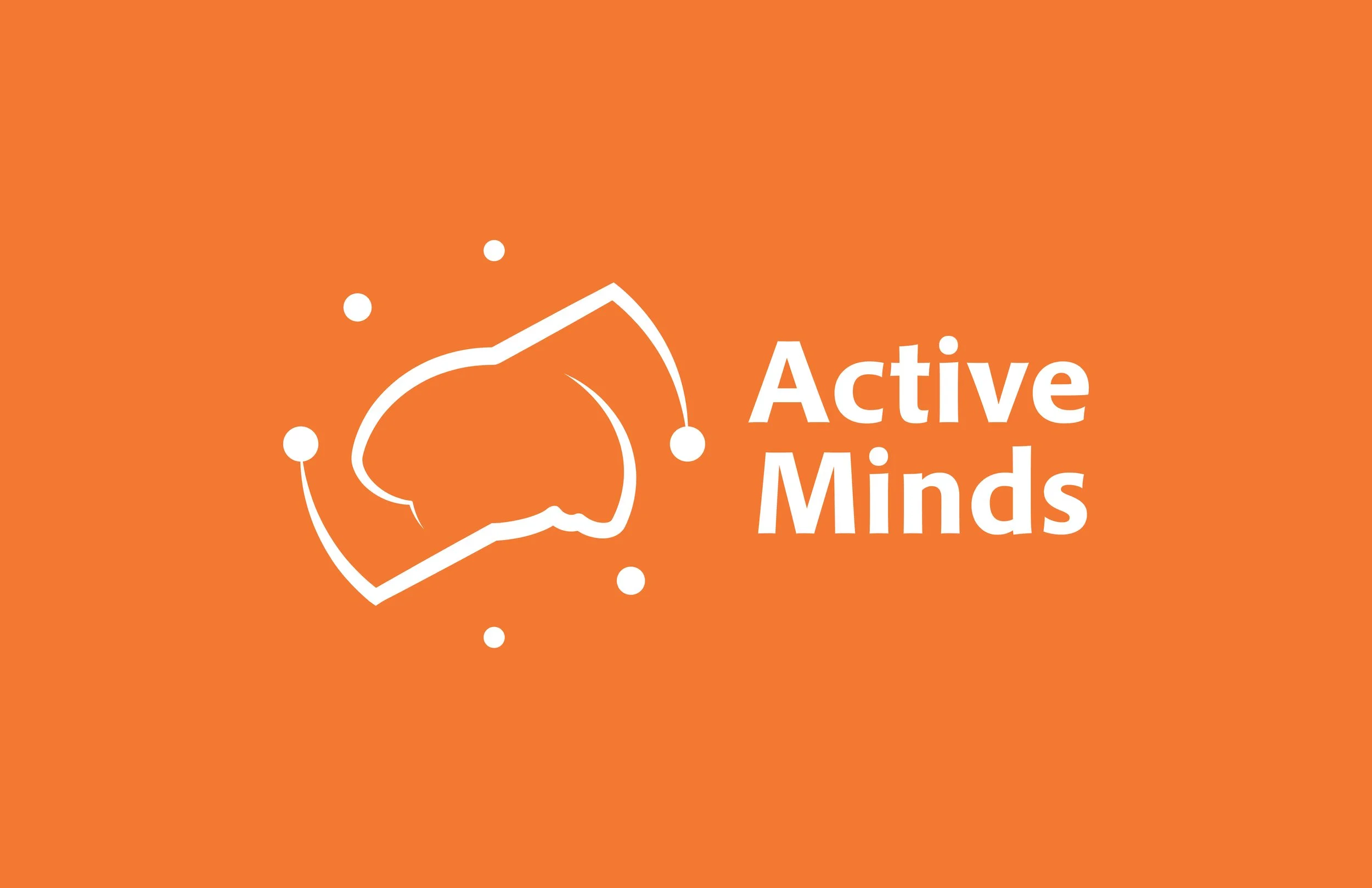
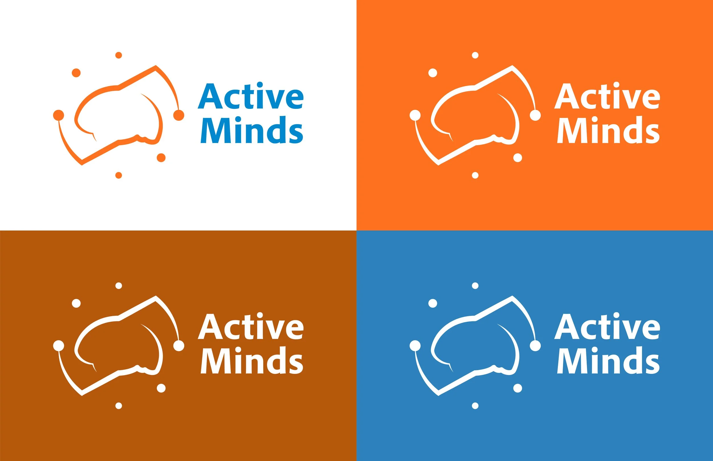
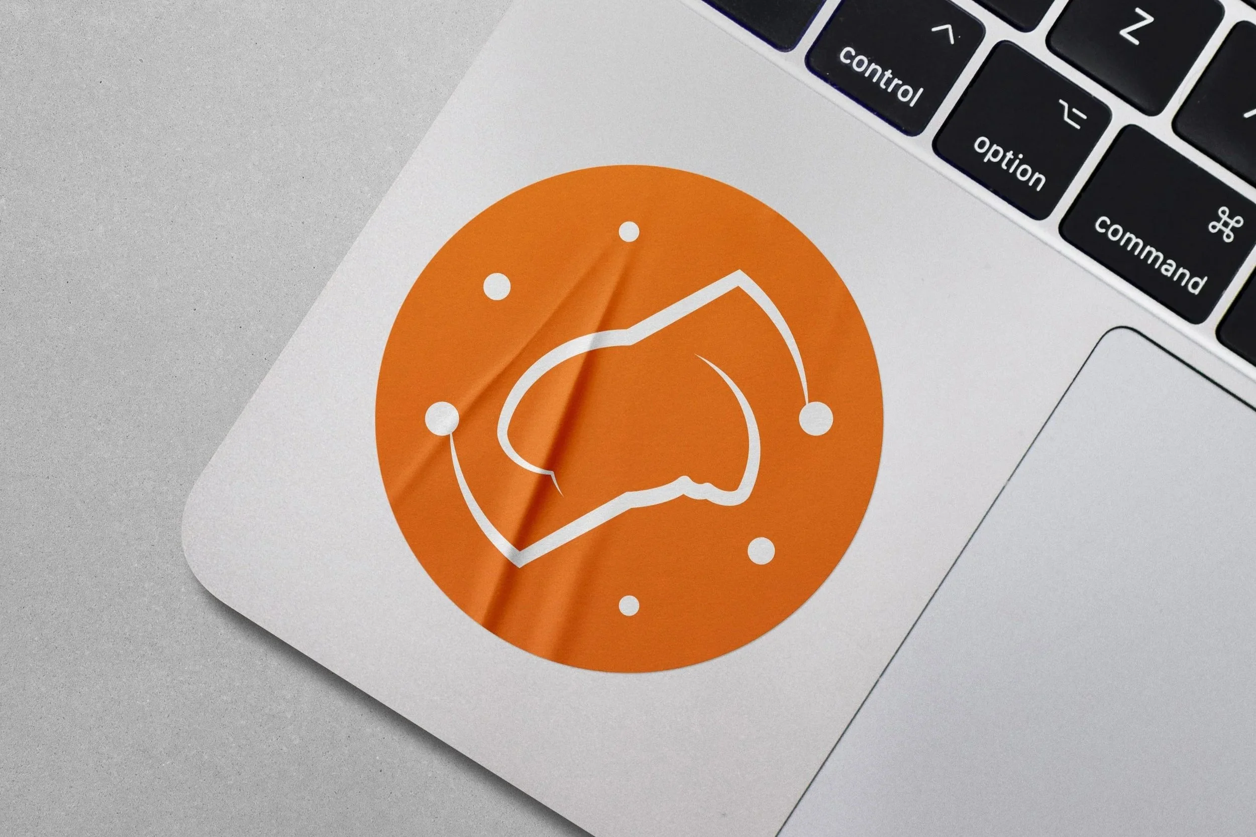
The identity centers on a simplified brain mark surrounded by six dots, symbolizing peer support and connection. Bright colors, playful shapes, and adaptable layouts help the system feel uplifting and approachable across digital and physical spaces. Typography set in Pelago Regular and Bold reinforces clarity, openness, and positivity.
Process
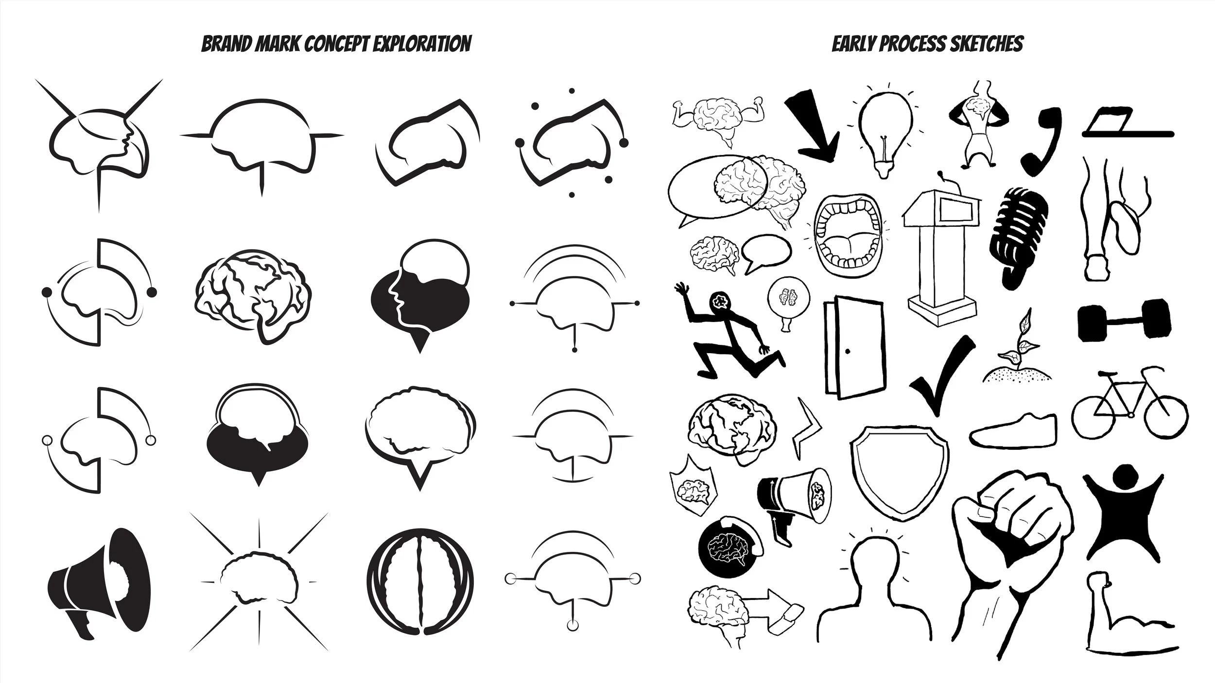
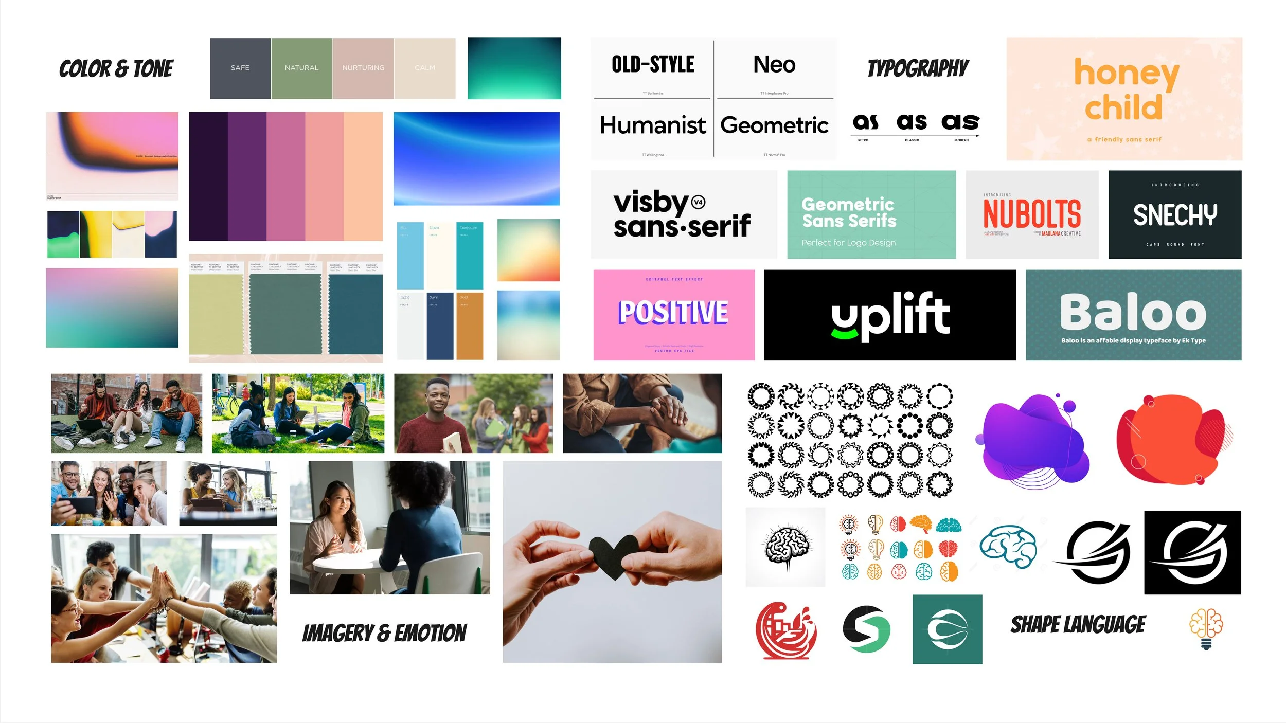
Early concepts explored multiple ways to represent community and support, focusing on a simplified brain symbol and circular forms inspired by the organization’s original identity. The image on the left shows a range of mark explorations paired with early stage sketching as the ideas began to take shape. On the right, a mood board helped guide the visual tone, which is bright, positive, and approachable. With critique and refinement, the mark evolved into a clearer and more optimistic symbol.

Applications
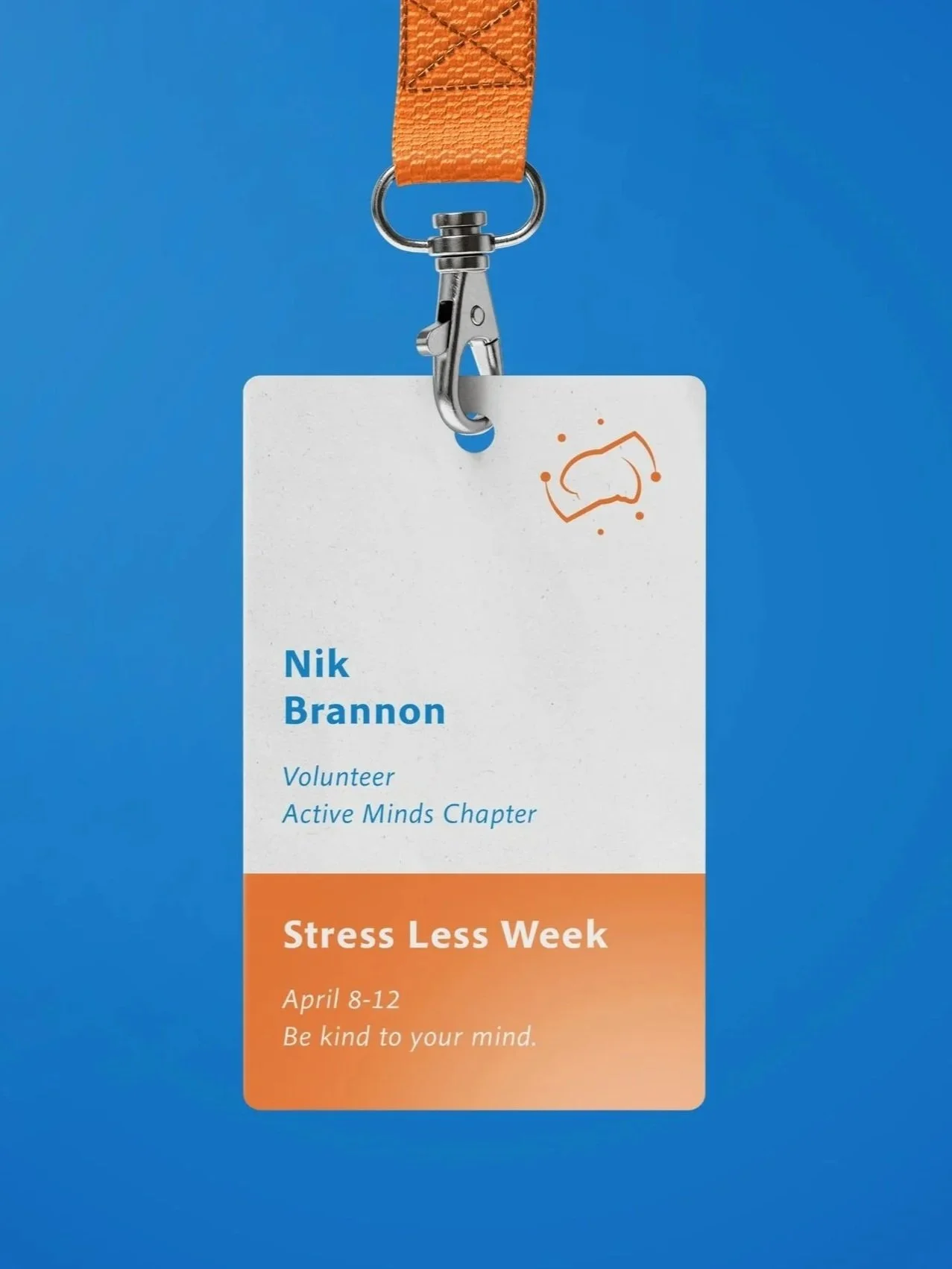
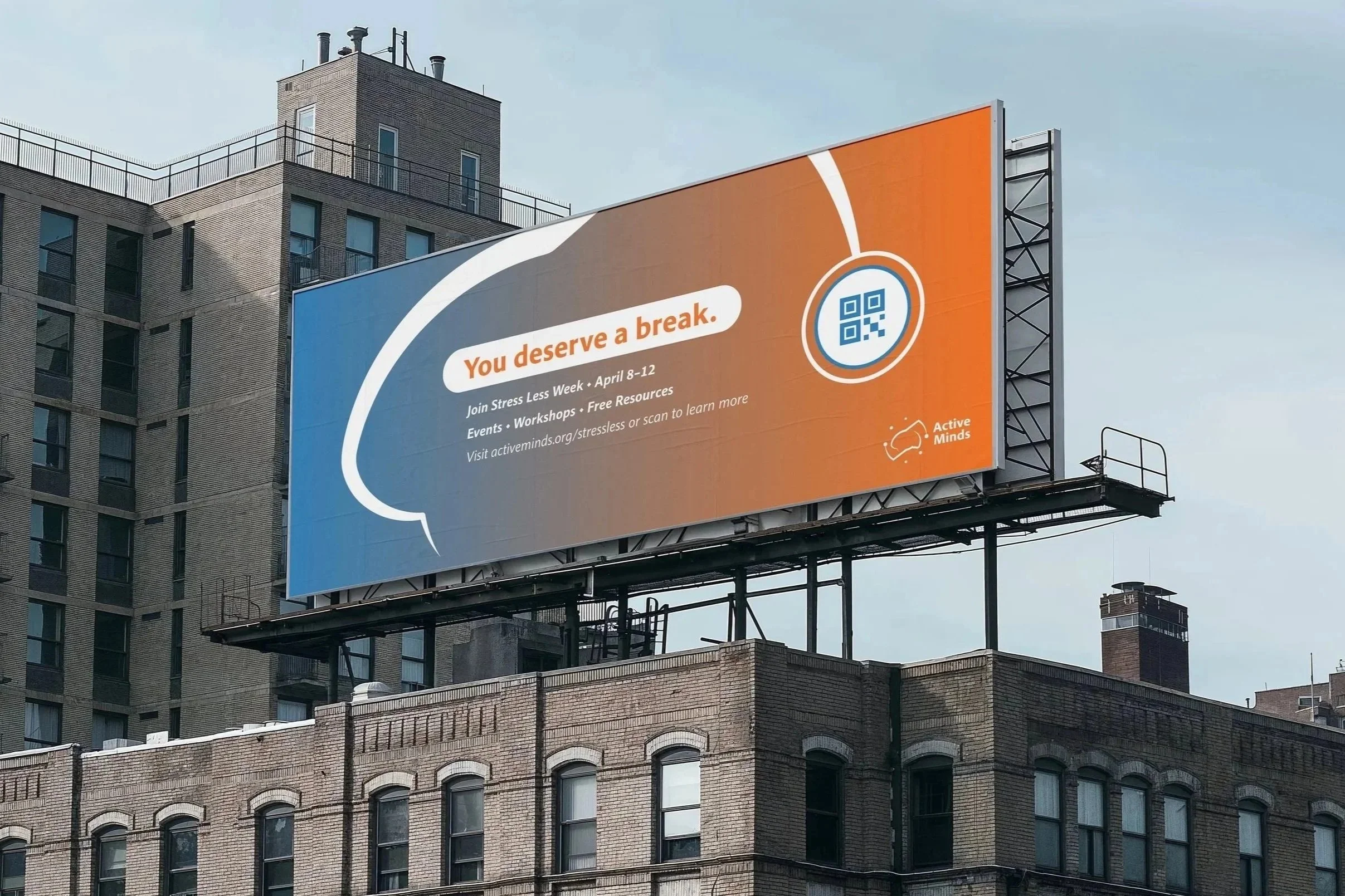
The applications include branded stickers, a volunteer identification card for events and fundraisers, and a billboard design demonstrating how the brand could appear in the real world. Together, these touchpoints bring the Active Minds identity to life, highlighting the organization’s mission and values while supporting its mental health initiatives for students.

Reflection
This was my first full branding project in college, and it gave me a real introduction to the intricacies of logo development and visual identity systems. I discovered how enjoyable the process of research, iteration, and refinement can be, and I’m proud of the final outcome. Above all, designing a brand that makes mental health support more visible, approachable, and uplifting for students felt especially meaningful, as it reflected a mission I cared about deeply during my time in school.